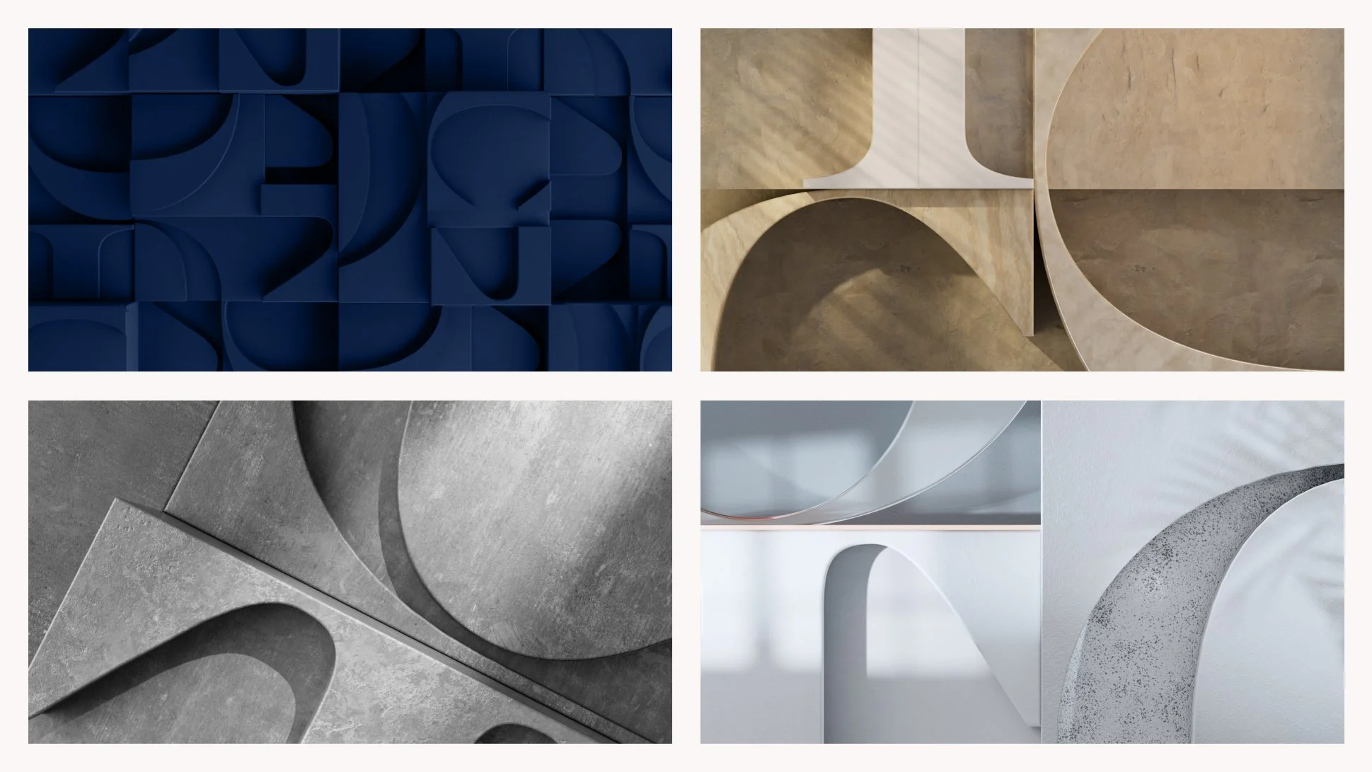
TCC
Trammell Crow Company has been a leader in building development since 1948. They tasked us with creating a new look and web experience that would align with their global expansion and pay homage to the heritage of the company.
Expanding in all directions, the logo uses precise geometry and organic counter-shapes to create a clear, and purposeful brand mark.
The graphic elements extend that growth mindset through a library of expanding shapes. Highly modular in all directions, the graphic elements help create bold communications unique to TCC.
Role: Creative Direction, UI Design, Design
Agency: Code & Theory


Steelwave
With a 9.1 million square-foot portfolio and nearly 5 decades of successful real estate operations, SteelWave has become a household name in the industry. With properties ranging in commercial, residential, and mixed-used, Haus designed a site that puts each property in the spotlight while elevating the new SteelWave look, feel, and voice.
Inspired by minimalism and using the simplicity of black and off white, we created an editorial look which paralleled SteelWave's credibility as a creative force in the market. Using negative space, intricate text styles, and subtle movement throughout the user can easily digest each page and appreciate the large-scale photography. Because each SteelWave property is unique, we also created a system that allowed us to make each property page as special as the content it displayed.
Role: Creative Direction, UI Design, UX Design, Design
Agency: Haus
Live Site: Steelwave.Com
Accolades: FWA Site of the Day and Awwwards Site of the Day
Tipico Sportsbook
On Jan 1, 2023, Ohio would legalize sports betting meaning Tipico, a well established sports betting presence in Europe, could be a first mover in the US market. Armed with ambitious goals for awareness and acquisition, the ask was simple: Win Ohio.
We created a design system and campaign that spoke to Ohio sports fans the same way they speak to each other. We also prioritized how the campaign would evolve duriing key sporting moments throughout the year and how it all stayed connected across digital channels, traditional channels, and the app itself.
Registrations in the great state of Ohio skyrocketed. One month post-launch the brand has already reached 57% of its 2023 acquisition target and 32% share of voice in the Ohio market.
Role: Creative Direction, Design
Agency: Code & Theory
Accolades: W3 Gold Winner in marketing - campaigns, banner display, rich media

Uber Brand
In 2018 Uber launched a new brand and look. Using only a PDF brand book, Haus was tasked to elevate the experience by creating a responsive and interactive brand guideline hub.
After analyzing the thorough new brand, we realized that we should base everything off one of Uber’s newfound pillars; the U. By considering its detailed guidelines, we created a functional grid system which also payed homage to the brand. We also considered the user and were capable of giving them a website that was functional for everyday use while maintaining excitement.
Role: Art Direction, UI Design
Agency: Haus
Grand + Nash
Grand + Nash is a newly renovated space that embodies the rich blend of natural and manmade textures. Through identity, typography, color and pattern, we placed an emphasis on movement and growth, drawing parallels between the abundant foliage and modern architecture.
We utilized a long scroll format with flowing parallax which guided the user through the highlights of the property, featuring high-impact renders of what it will look like. With multiple galleries and an interactive site plan, users can easily explore the amenities of the space and dive deeper into the inspiration behind it.
Role: Art Direction, Brand Identity, Design
Agency: Haus
Live Site: Grand+Nash.Com
Accolades: Selected site on Site Inspire and CSS Design Awards Site of the Day.
Netflix
Netflix tasked Haus to create a interactive press kit that would be shared with well-known publications to tease the new season of Mindhunter. Each journalist was given a special link to access the 200 press photos but like every good mystery, there was a twist.
With so many photos to sift through, each journalist had to make their selection of just 8 photos within 90 minutes before the link expired. Visitors that viewed over 60 photos within the time frame were presented with a special trailer as an easter egg.
To create an even more immersive mood, we played the show's eerie soundtrack in the background as journalists explored the light box. Subtle effects like a flickering light tube inside the light box further added to the physicality of the experience, along with the ability to pick up the slides, shuffle them around, and even collide them off the walls of the box and each other. The end result was a buzz-worthy interactive press kit that got journalists excited and talking about what's to come for Season 2 of Mindhunter.
Role: Art Direction, UI Design, UX Design, Design
Agency: Haus
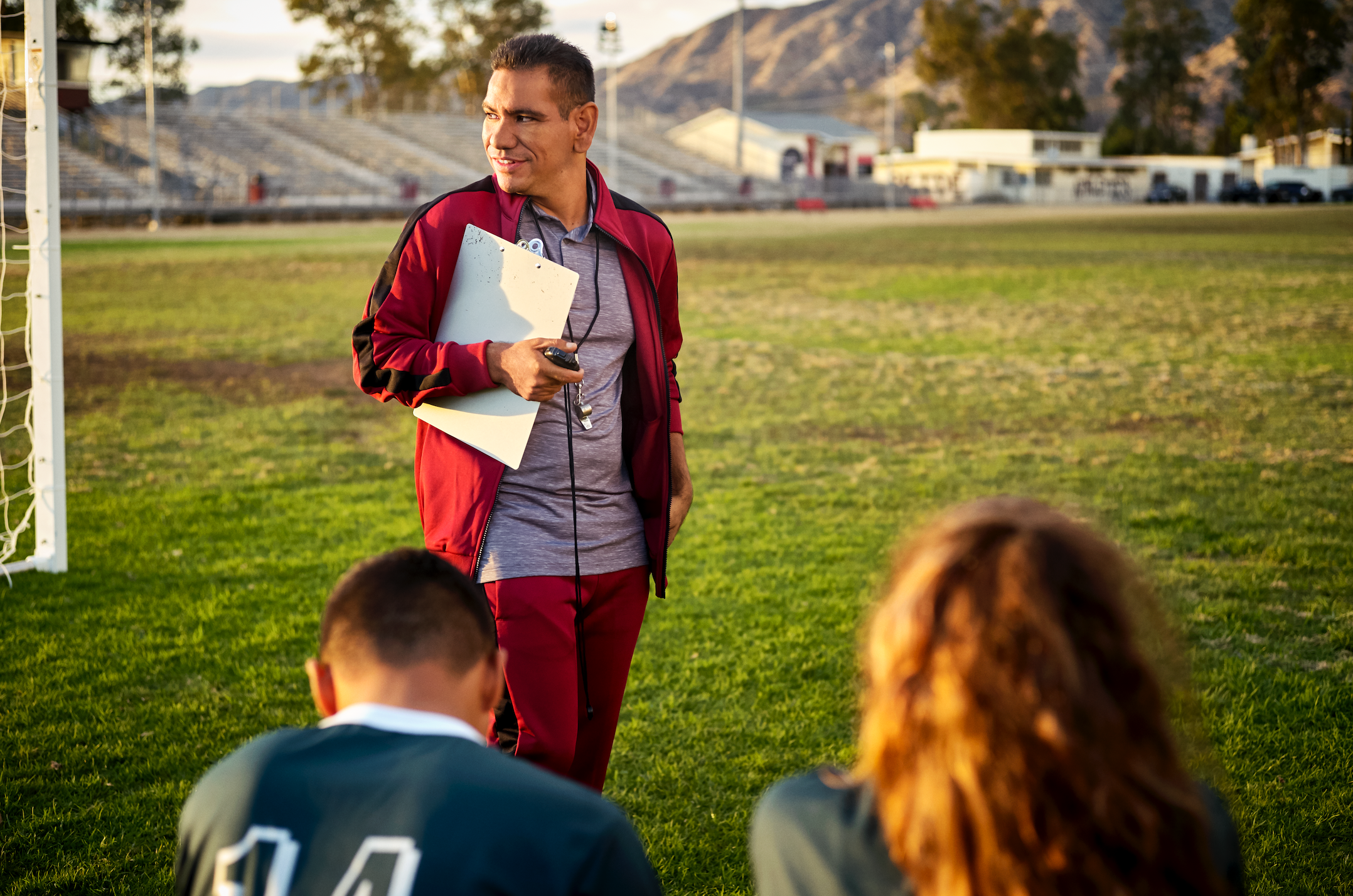
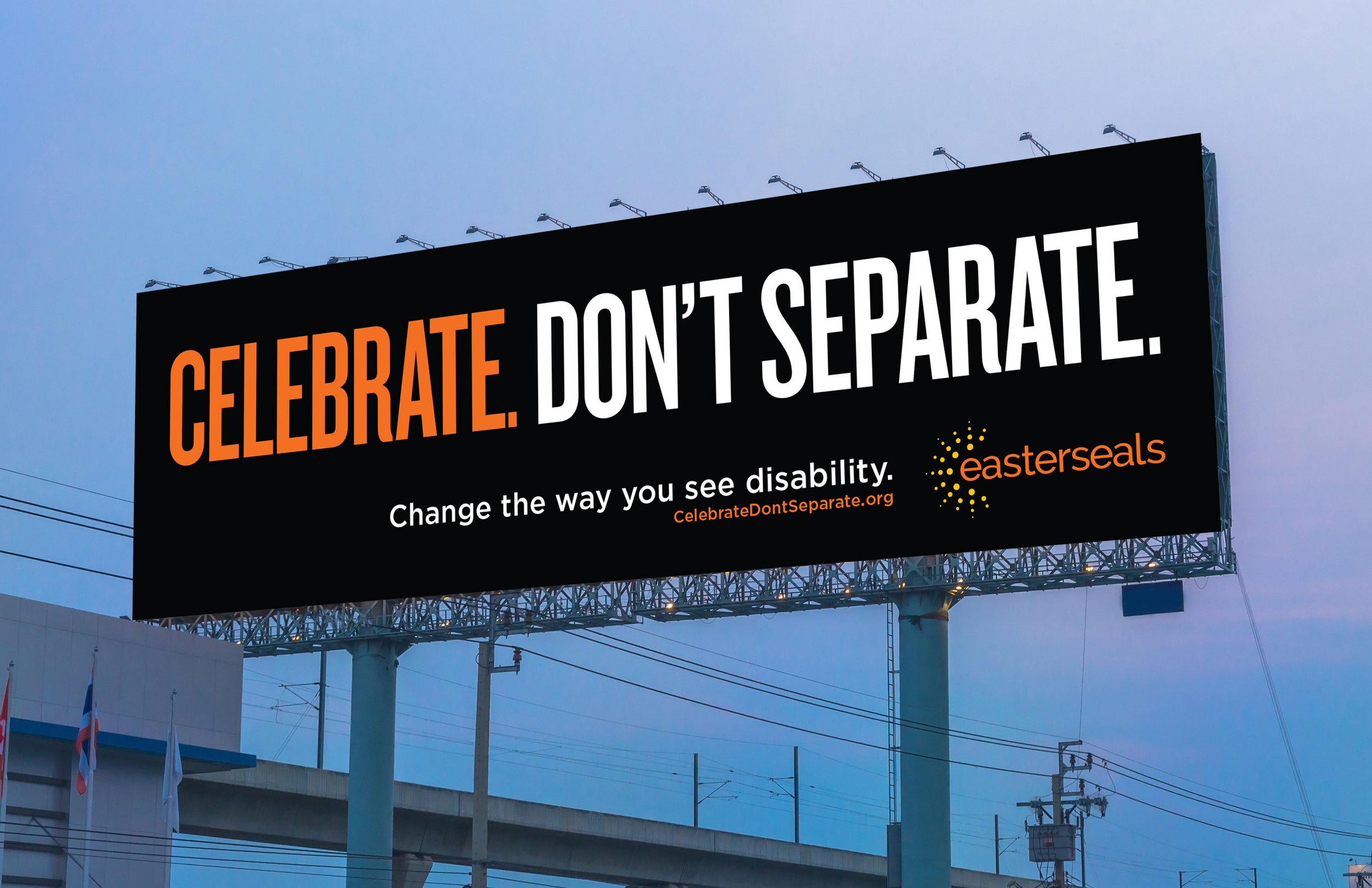
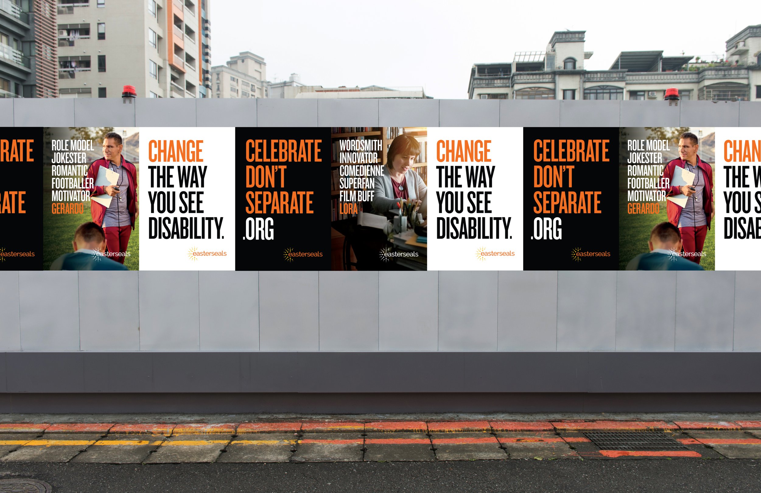
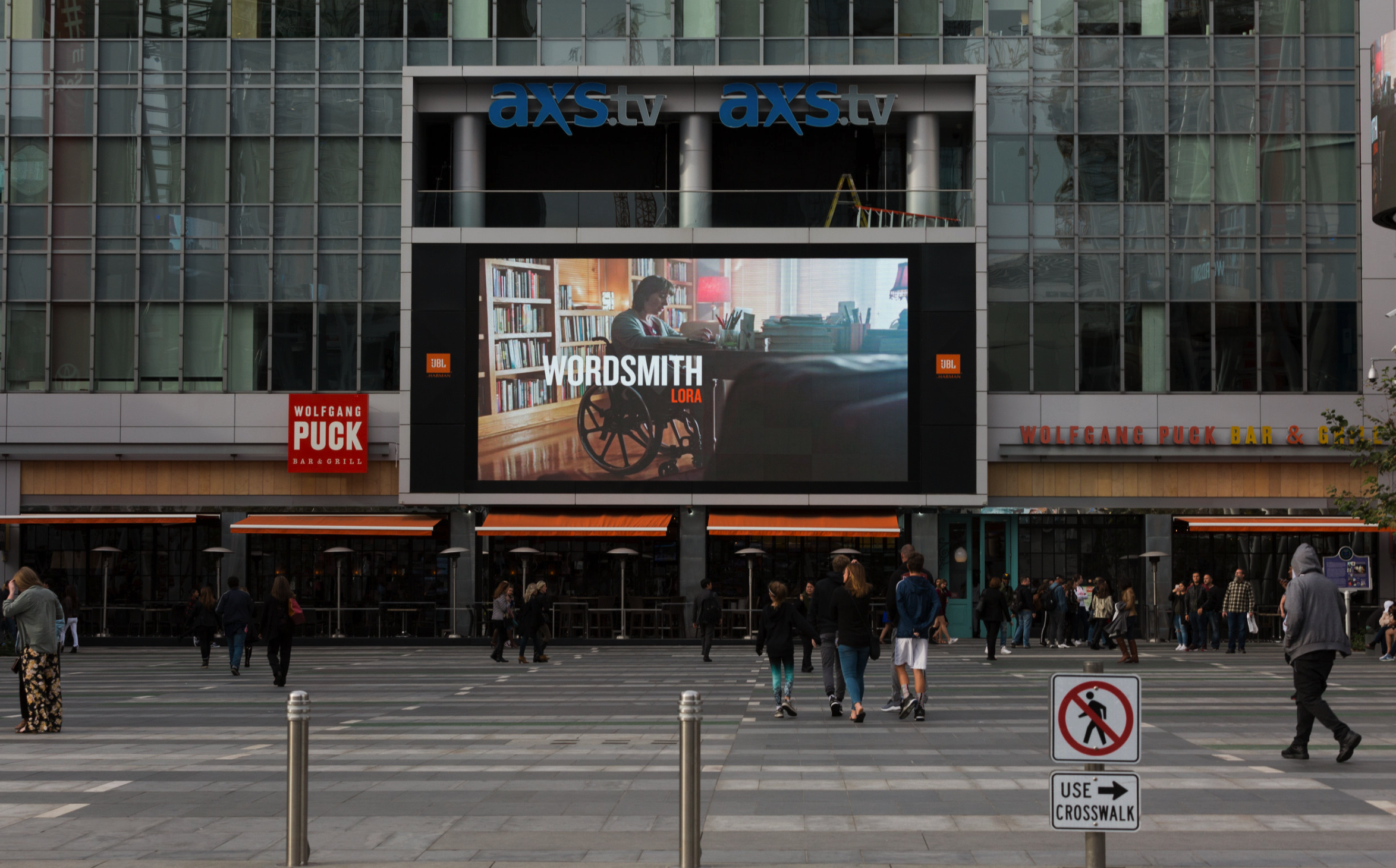
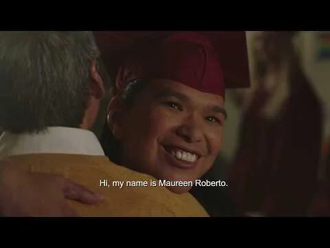
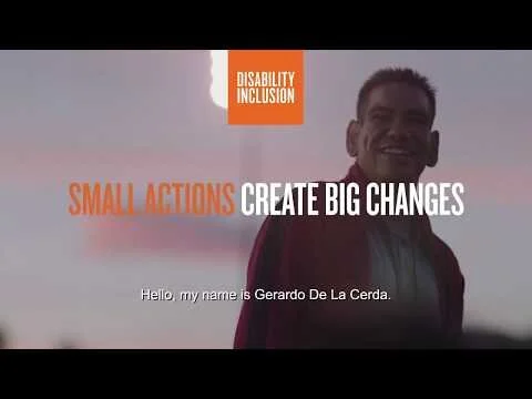
Easterseals
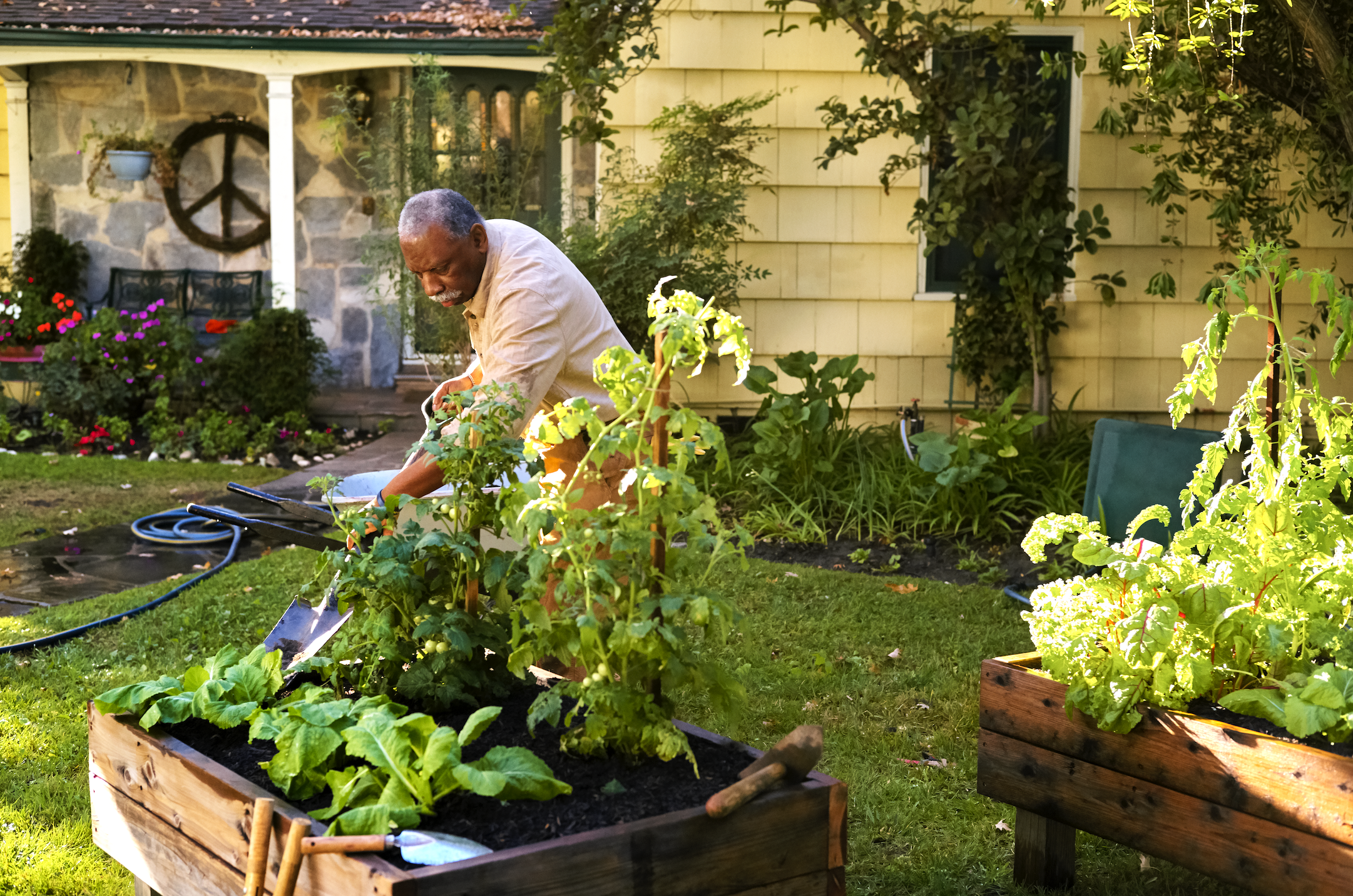
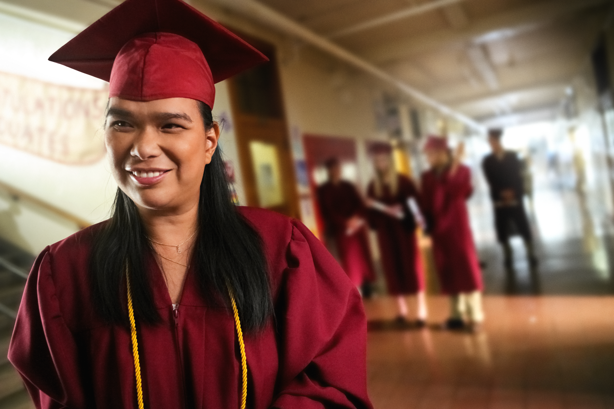
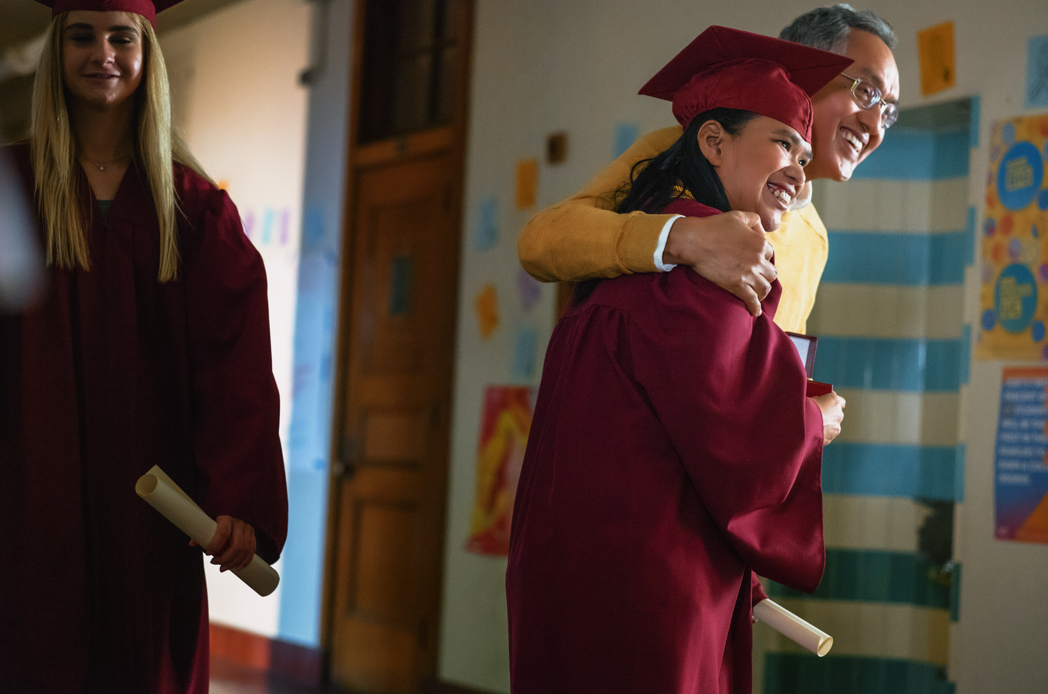
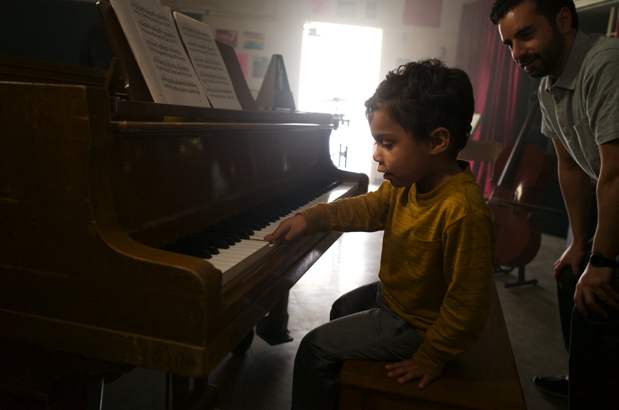
Easterseals, a non-profit that offers programs for people with disabilities wanted to remind us all to see past disability and appreciate individuals for who they are. Simultaneously the century-old organization needed to reclaim relevance to the modern world. We developed a campaign that directly addressed these preconceptions and paired it with a social component to help the message spread among today’s audiences.
Role: Concept, Art Direction, Design
Agency: ELA
Fin.